Scope Financial
A modern financial tracking application with cash flow visualization and real-time insights. Designed to help users understand their financial picture and make better decisions through clear, data-driven dashboards.

Client
Scope Financial
Year
2020-2025
Service
UI & UX
Product Design
Web Design
Product Status
Scope Financial is an actively iterated product initiative. The current version runs in a fully functional demo environment with representative data; live bank connections (e.g., Plaid) are planned in future iterations.
The Problem
People lack a clear, unified view of their finances. Financial data lives across too many accounts and tools, making it difficult to understand net worth, spot trends, or plan ahead. Existing tools either oversimplify the problem or overwhelm users with complexity.
The Goal
Create a single, clear view of a person's finances that makes it easy to understand where they stand, track changes over time, and plan ahead with confidence.
Constraints
- Cross-platform (web + mobile)
- Clear presentation of complex financial data
- Scales across accounts and time ranges
- Designed to work without live bank connections initially
- Prioritizes clarity, speed, and trust
Process
1. Ideation & Wireframes
Explored multiple dashboard structures and navigation patterns to determine how complex financial data could be grouped, prioritized, and scanned quickly. Early concepts focused on hierarchy, data density, and scannability before any visual polish or system constraints.
Mobile v1
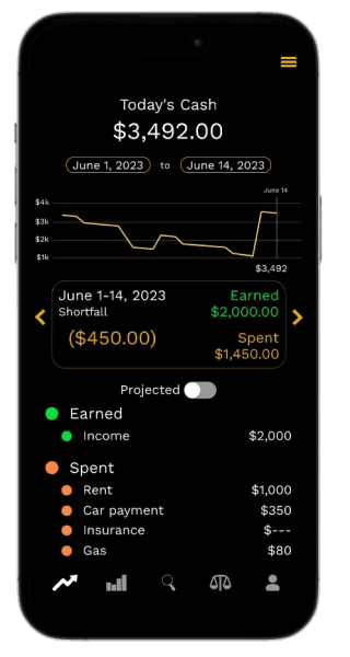
Initial mobile-first concept focused on understanding daily cash flow and short-term trends.
Forecast v1
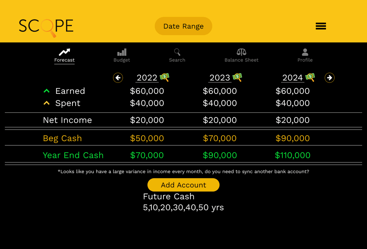
Early exploration of long-term projections and multi-year financial planning before committing to a full system architecture.
Transactions v1
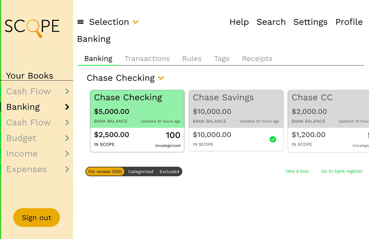
Early desktop exploration shifting the product from a single-screen concept into a multi-section financial system.
2. Mid-Fidelity Designs
Refined layouts and information hierarchy, translating early concepts into more structured systems. Established grids and reusable patterns to support consistency across dashboards, accounts, and projections.
Dashboard v1
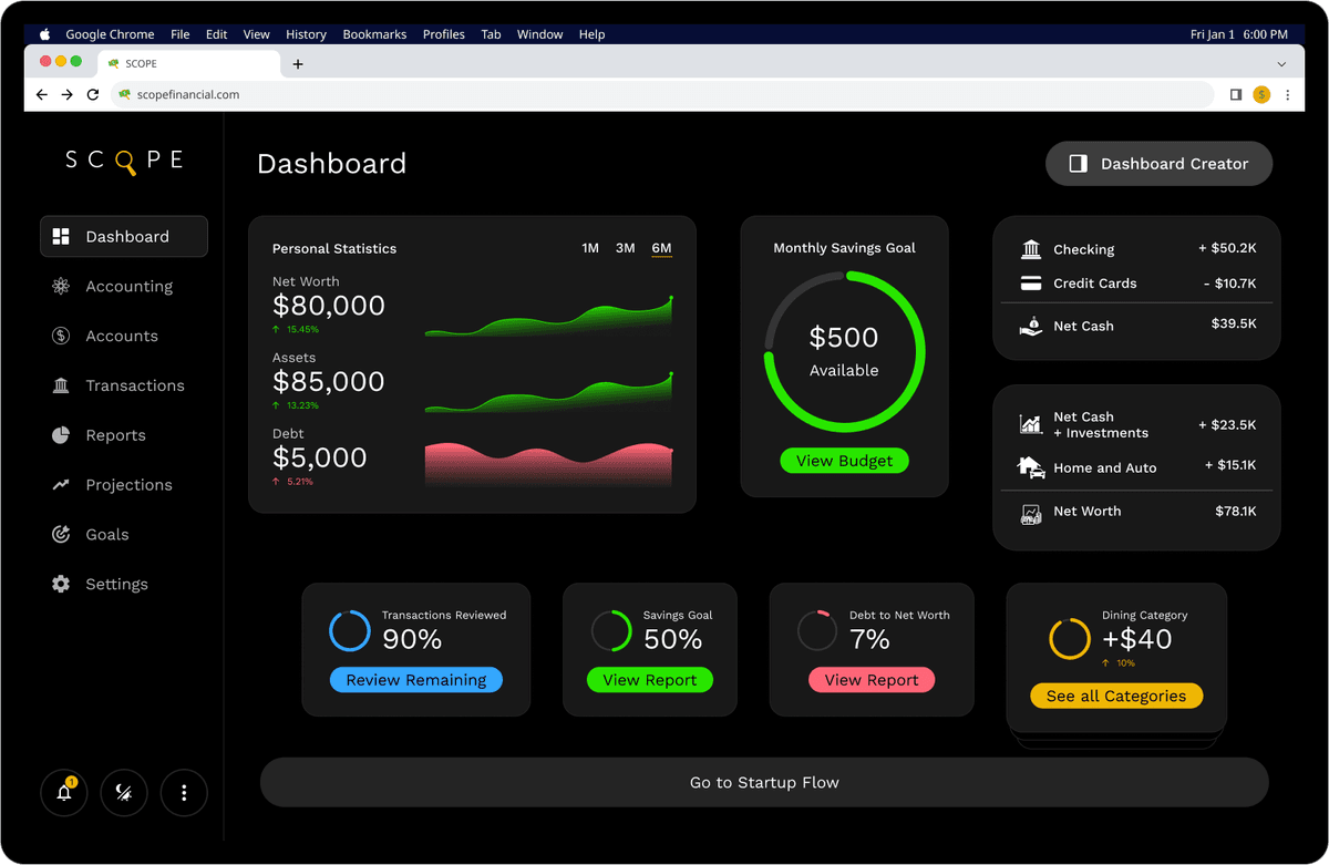
Dashboard layout establishing the core information architecture and card-based modular system.
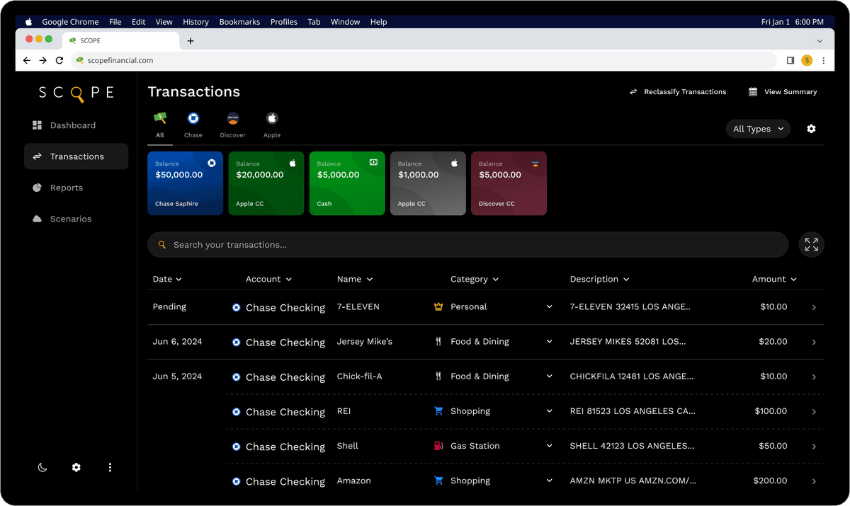
Transactions v2
Transaction list view focused on filtering, categorization, and high-volume data scanning.
Projections v2
Projections interface exploring timeline-based comparisons and scenario planning.
3. High-Fidelity UI
Finalized visual design, typography, spacing, and interactions with a focus on clarity and data legibility at scale. Iterated using realistic data scenarios to ensure the UI remained understandable across complexity and volume.
Final Dashboard — Modular Overview
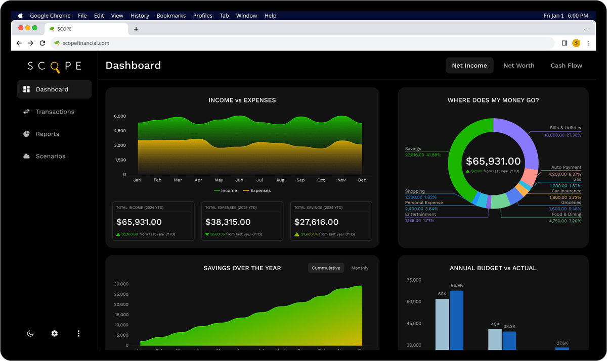
Final dashboard bringing together net worth, cash flow, budgets, and category performance into a single, scannable overview.
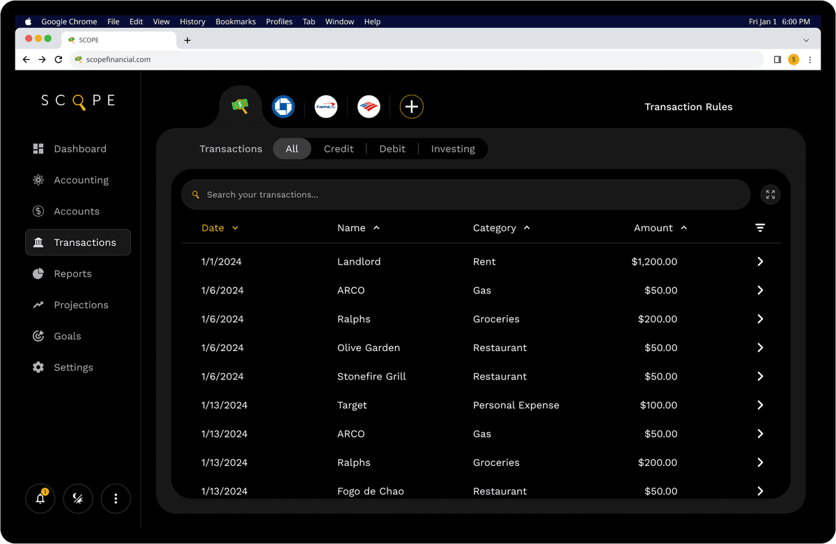
Final Transactions — Data Review UX
High-density transaction view optimized for filtering, categorization, and rapid scanning of financial activity.
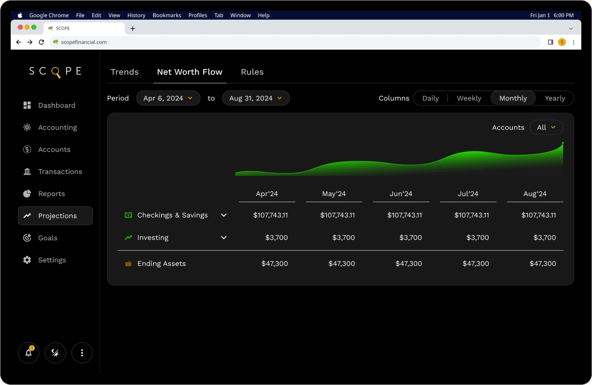
Final Projections — Scenario Comparisons
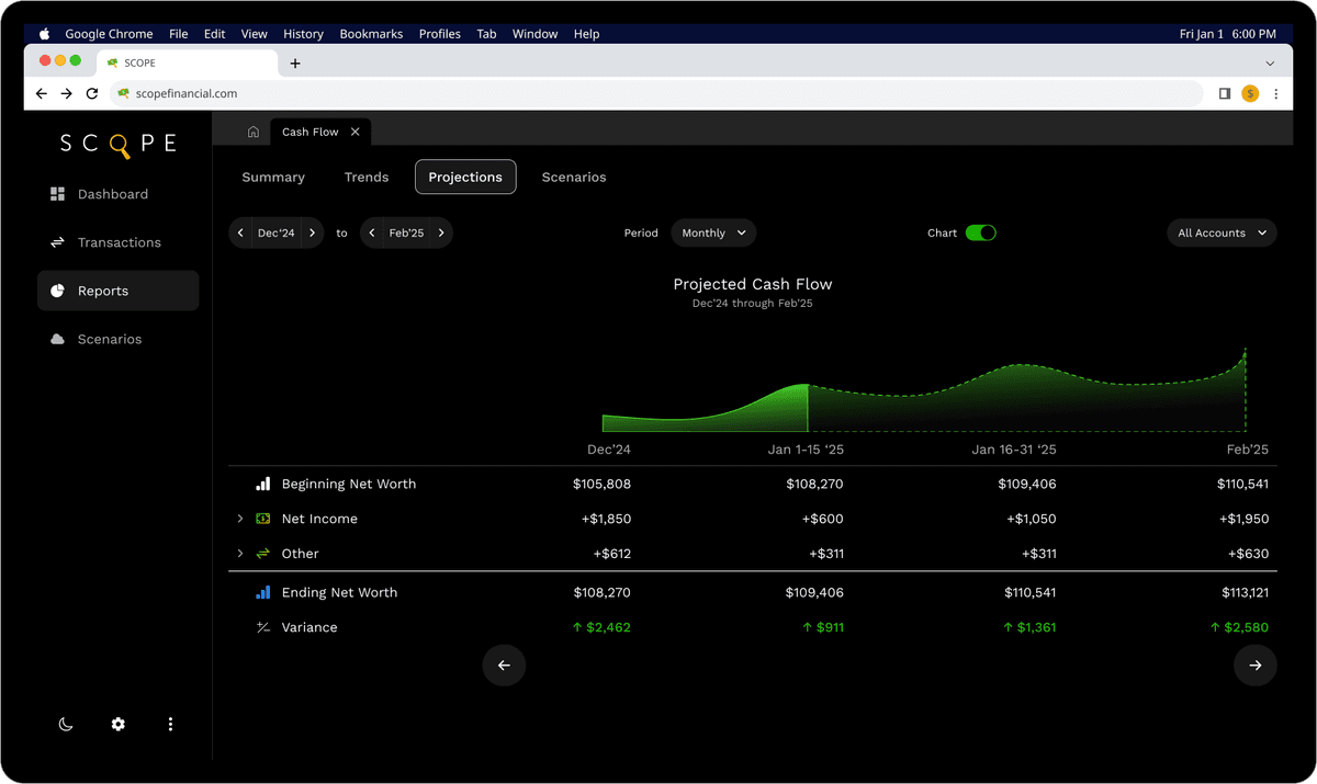
Detailed reporting and projections views supporting long-term planning and scenario comparison.
Execution & Collaboration
I worked closely with a developer to translate designs into a real, working product. My role covered product definition, UX, UI, and iteration, while engineering focused on implementation and infrastructure.
As the product moved from design to code, real-world constraints shaped many decisions: data performance, edge cases, and the need to simplify or restructure parts of the interface. This required prioritizing core user flows, breaking complex screens into reusable components, and continuously refining designs to align with what could be built reliably.
We focused on building a functional internal version using real queries and realistic data scenarios. Although full user onboarding and Plaid integration were not yet production-ready, this approach allowed us to validate the core product structure, navigation model, and data presentation before investing further in polish or growth features.
Outcome & Learnings
Over multiple major iterations, Scope evolved from early layout explorations into a cohesive, demoable product capable of handling complex financial data in a clear, structured way. While not yet publicly launched, the project demonstrates long-term product thinking, system-level UX design, and readiness for production implementation.
Key learnings:
- Structuring dense, data-heavy dashboards without overwhelming users
- Evolving a product across multiple major versions as scope and constraints change
- Designing reusable components and layouts that scale with complexity
- Balancing clarity, depth, and performance in financial interfaces