Tivvity
Track your time, discover your patterns, and start living more intentionally.
An iOS time tracking app designed around awareness and reflection rather than optimization. Built to help people understand how they spend their time without imposing rigid structure or performance pressure. Currently in private beta.
Role
Product Design
UX & UI Design
iOS Development
Timeline
~2 months, ongoing
Platform
iOS
Status
Private beta, 5 users
The Problem
The idea for Tivvity came from using Apple's Screen Time and realizing it only shows a small slice of how a day is actually spent. Screen Time tracks what happens on a phone, but not the many hours spent working, exercising, socializing, or resting away from the screen.
I wanted a way to see all of my time in the same way Screen Time visualizes digital usage, with category-based breakdowns applied to real-world activities through simple calendar views and manual logging.
But most time tracking apps focus on rigid schedules, optimization, and performance metrics. They push users toward efficiency rather than awareness. Many people don't want that pressure. Existing tools often feel stressful, guilt-inducing, or overly structured, turning something simple into a burden.
The Goal
Build a lightweight, flexible way to log time and help users reflect on patterns without gamification, pressure, or rigid planning.
Focus on awareness first, intentional change second. Let people see where their time goes, understand their patterns, and make adjustments on their own terms.
Constraints
- Solo designer and developer
- iOS only
- Limited time (~2 months so far)
- Must be fast to log
- Must feel emotionally calm and forgiving
- Needs to work even if users don't log perfectly
Product System Overview
The app is built around a simple mental model: users log time to an Activity, and Activities belong to a Category.
Time appears in three main views: Calendar, Dashboard, and Goals. Over time, patterns emerge without forcing behavior or requiring perfect adherence to a system.
This structure allows flexibility while still providing enough organization to surface meaningful insights about how time is actually spent.
UX Flows
Add Time Flow
A fast, low-friction flow for logging time after the fact, designed to avoid timers and interruptions while staying accurate.
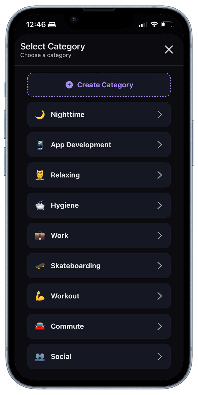
Categories organize life areas (work, health, rest, etc.) and act as the primary layer for grouping activities and insights.
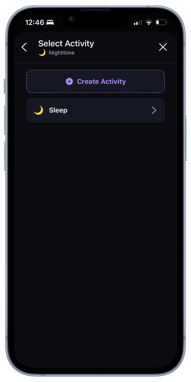
Activities live within categories and represent the specific things users want to understand and reflect on over time.
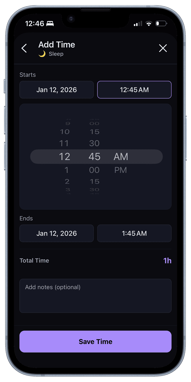
A fast, low-friction flow for logging time after the fact, designed to avoid timers and interruptions while staying accurate.
Calendar & Timeline Views
Multiple views for understanding time at different scales, from daily structure to long-term patterns across weeks and months.
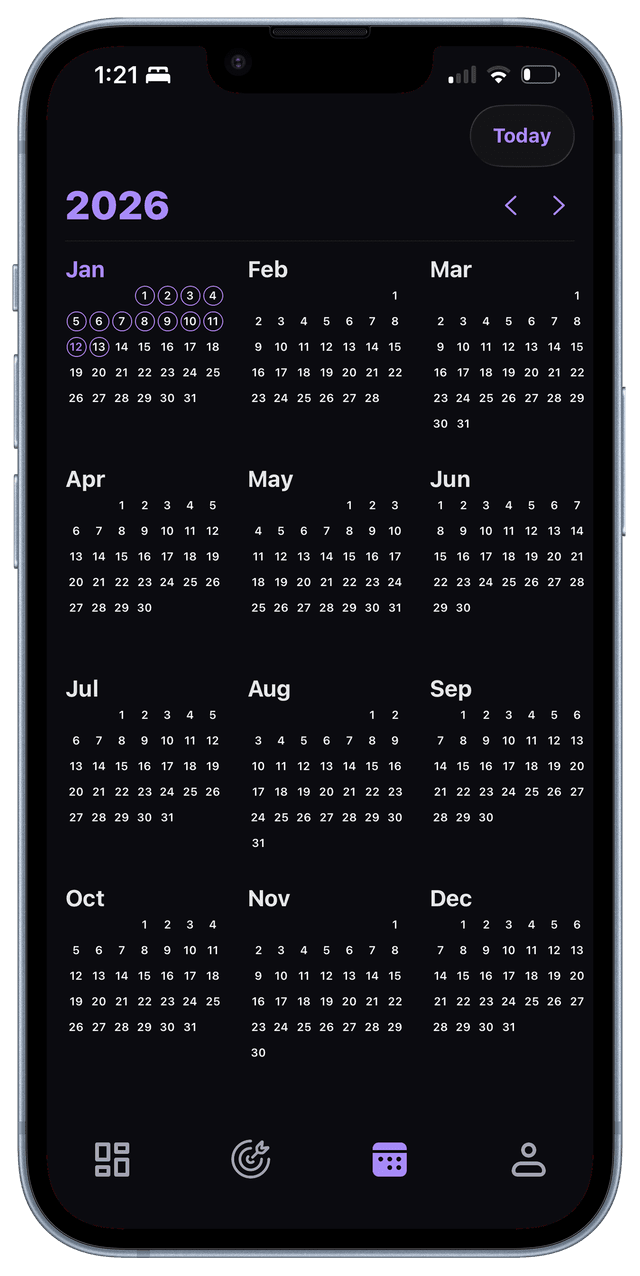
Calendar Yearly View: Overview of activity across months to reveal habitual patterns.
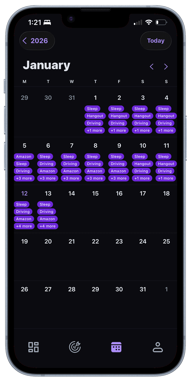
Calendar Monthly View: Overview of activity across days to reveal habitual patterns.
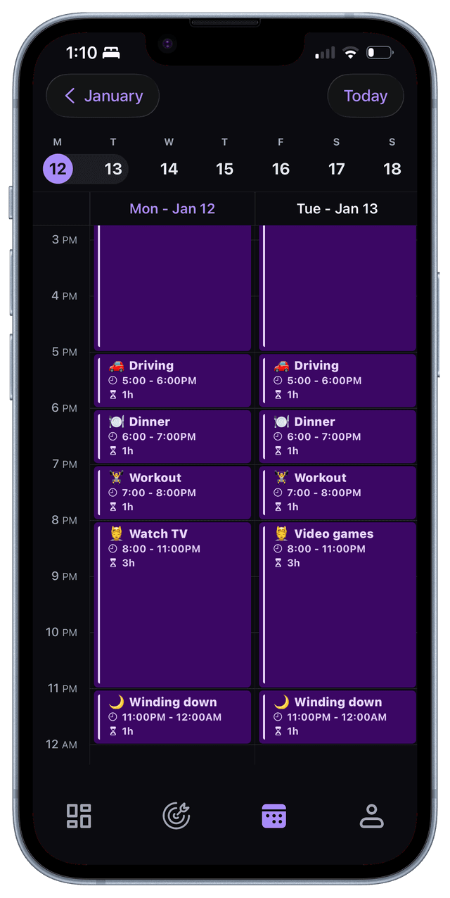
Calendar Weekly View: A time-based layout for reviewing and adjusting how a day is structured, focused on understanding time flow rather than scheduling tasks.
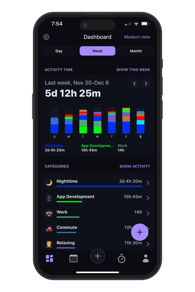
Dashboard (Insights View)
A visual breakdown of time spent by category, helping users reflect on where their time actually goes over a selected period.
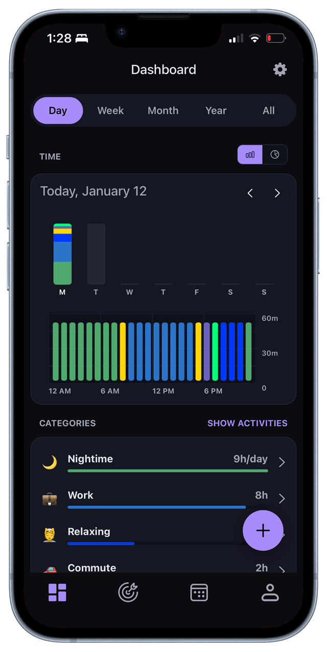
Daily Bar Chart
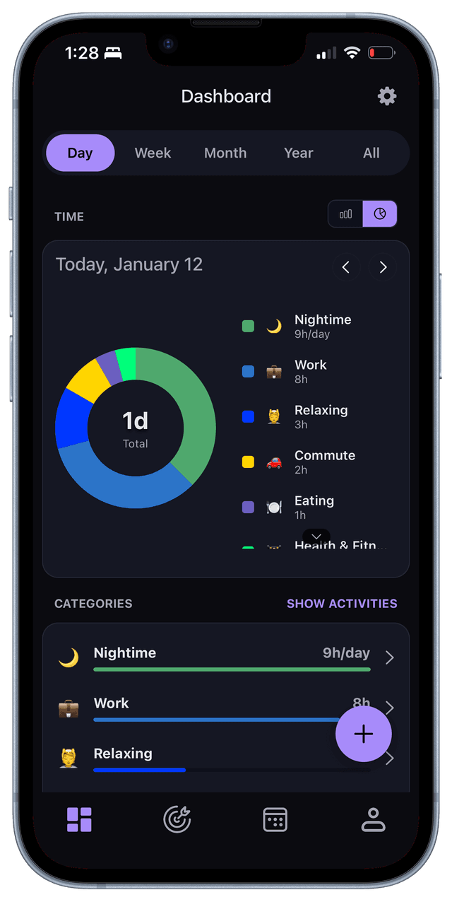
Daily Pie Chart
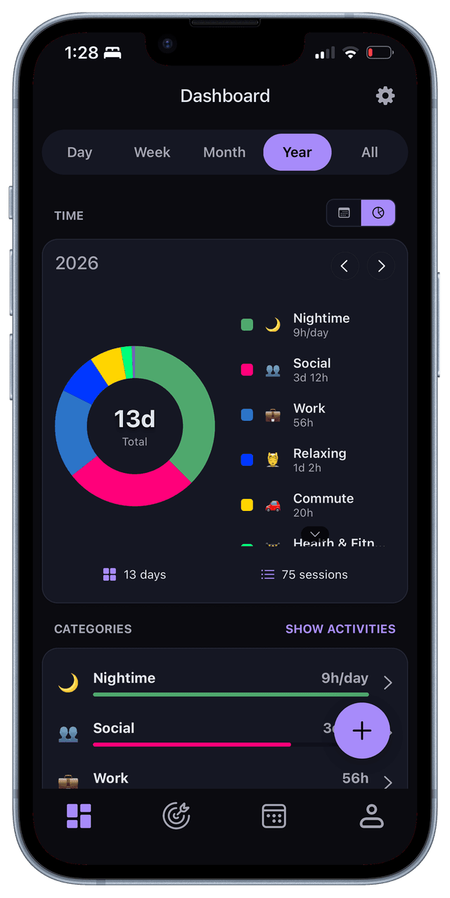
Yearly Pie Chart
Goals View
A lightweight goal system that tracks time or frequency per activity without imposing streaks, pressure, or rigid targets.
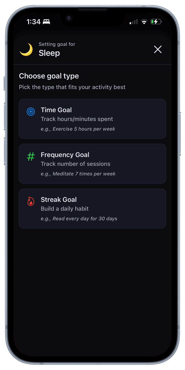
Choosing goal type
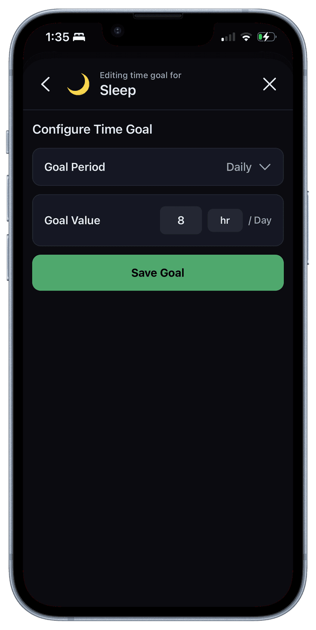
Creating time goal
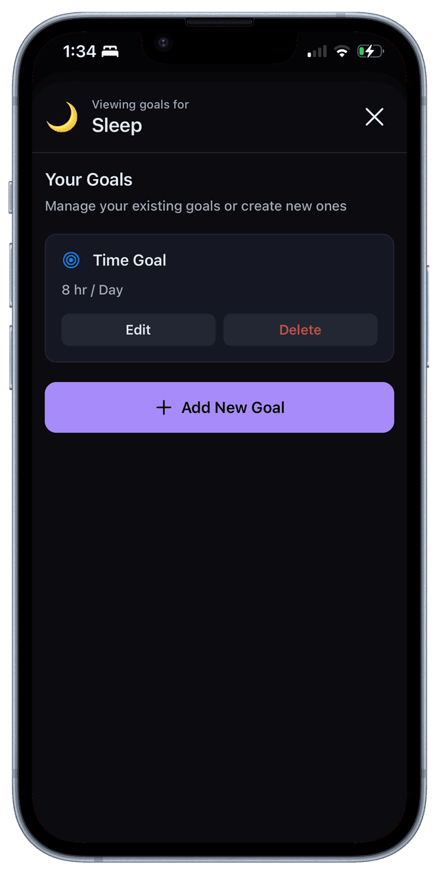
Viewing goals
Visual Design
The visual system is built around calm, non-alarming aesthetics. Dark mode is the primary design direction, with soft gradients, rounded surfaces, and a color palette that avoids the harsh, performance-driven look of typical productivity dashboards.
Every design decision reinforces the core principle: this is a tool for awareness, not judgment.
Execution
I designed and built the entire product myself—UX, UI, product strategy, and iOS engineering. Working in code shaped many design decisions in real time, allowing for faster iteration and tighter integration between design and implementation.
The app is currently in private beta with 5 real users. It's iterated weekly based on actual usage, not assumptions. This direct feedback loop has been critical in refining the logging flow, adjusting the visual hierarchy, and understanding what people actually need from a time tracking tool.
Outcome & Learnings
Tivvity is now a usable daily tool. It's being used by real people to understand their time, and it's still evolving based on that usage.
Key learnings:
- Logging must be faster than perfect
- Reflection beats optimization
- Calm UI changes behavior
- Designing and building together improves quality
- Many users prefer reviewing over planning